The objective of this project was to first come up with a small business idea and then choose all the building blocks to making it happen and finally creating a website. Below are finished products of all the pages created for said project and I will describe my process and what I have learned from it in the paragraphs following.
As stated above, these are the finished products of a long journey on creating a website that looks both clean and professional. The first part of this project was to come up with a business you would like to do. My choices were between either a game shop, a candy store, and t-shirt online store. I ended up going with a candy store. Next, was to get all the extra details out of the way like a name, color palette, and a logo reflecting both. After much deliberation I decided on the name Caramelody Candy, as though it is sweet music for your taste buds. The color palette was a little more difficult to deal with and I went through numerous colors from chocolate and caramel looking colors to taffy and jolly rancher like colors. In the end, I decided a happy medium, both being a challenge and goal, was the best option for such a project. Afterwards, comps were made in Photoshop to reflect everything I needed to make an effective website, in a neat and orderly manner. Below are two pictures that represent my starting out point to my ending point on the homepage.
As you can see many changes were made over the course of a few weeks and despite it looking far better than the first, more changes were and can be made at anytime. That is why if you look at the main page up at the top and compare it with the picture right above this paragraph, a few more things were changed. You won't always make something everybody likes, which is probably the most important thing I learned from this project. Your goal is to just make something the majority likes without losing sight of what it is your advertising.
Coming away from this project I was able to take a look at my strengths and weaknesses. My weaknesses are primarily in choosing a proper color palette and choosing in fonts. I am sure I have others, but those two are the most noticeable. However, my strengths are in keeping up with hierarchy and a nice gridded design. I think my biggest problem in this project was finding the proper kind of inspiration. I felt that I knew what looked good and that was probably one of the dumbest things I have ever done. I know now how important researching the look of other sites is and asking myself, "Why does this work or why doesn't this work?" I am on the internet a lot as are we all, so why don't we look at what is around us to help the continuing flow of good design, while systematically removing bad design. As a designer speaking to other designers out there, take the time to look around you and absorb the material, but also ask yourself numerous questions about what you like from this website and how it compares and differs from other websites. That is an excellent foundation in getting yourself on the right path of becoming an superb designer.
Wednesday, April 4, 2012
Tuesday, December 13, 2011
Arguments and Methods in Scripting
Arguments and Methods are two more important concepts in the scripting world. Without these two pieces of code the objects are there, but nothing can happen because nothing is telling it what to do.
Lets refer back to our code that we wrote for the objects.
jump_btn.addEventListener(MouseEvent.CLICK, personjump)
function personjump(event:MouseEvent){
person_mc.gotoAndPlay("jump");
}
The parts that are highlighted are methods. Methods essentially hold functions that affect the object in some way. For instance, in the first method it is holding MouseEvent.CLICK, which means that nothing will happen to this object until the mouse clicks on the the object which in this case is the jump button. Also, the easiest way to figure what is a method, is by looking directly after it. Methods are always followed by parentheses. They may have stuff in them and they may not, but they always have parentheses.
Now lets look at that code again.
Lets refer back to our code that we wrote for the objects.
jump_btn.addEventListener(MouseEvent.CLICK, personjump)
function personjump(event:MouseEvent){
person_mc.gotoAndPlay("jump");
}
The parts that are highlighted are methods. Methods essentially hold functions that affect the object in some way. For instance, in the first method it is holding MouseEvent.CLICK, which means that nothing will happen to this object until the mouse clicks on the the object which in this case is the jump button. Also, the easiest way to figure what is a method, is by looking directly after it. Methods are always followed by parentheses. They may have stuff in them and they may not, but they always have parentheses.
Now lets look at that code again.
jump_btn.addEventListener(MouseEvent.CLICK, personjump)
function personjump(event:MouseEvent){
person_mc.gotoAndPlay("jump");
}
The next part that is highlighted is an argument. Arguments reside within the methods and give information to the methods on what needs to happen when the button is clicked. For example, the personjump argument is listed below in the second line as an argument then. It is now holding important information. The information is what actually happens meaning the person is going to jump. The timeline is going to move across to wherever it is marked "jump." Essentially this particular method links the two parts of top and bottom. The button will not cause the person to jump unless personjump is telling the person to jump on the timeline.
Functioning App
Finally after we made the documents in Photoshop, we created interactive pdfs and then finally animations briefly showing how our apps would actually function. This video just goes through some of the things you can click and modify in order to give you a taste of the possibilities this app has to offer.
PSD Documents
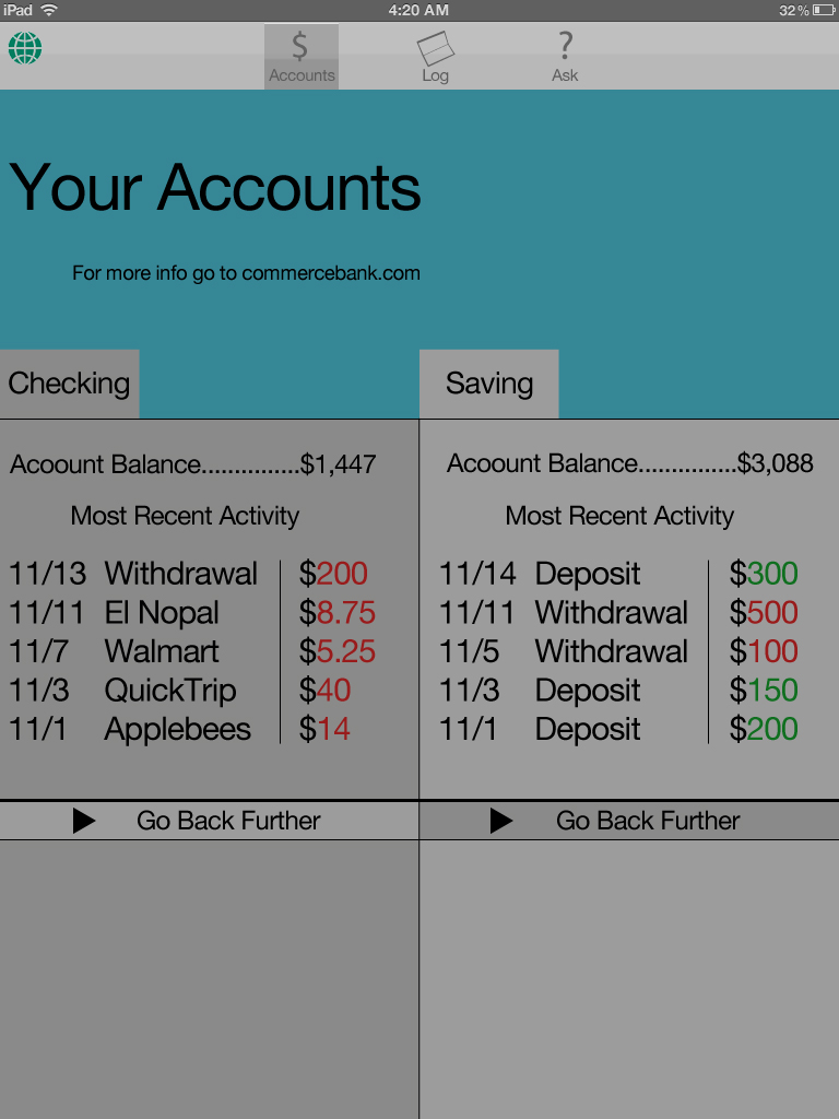
For about a month since I posted my ideas I have been battling through many different looks of how my app should look like. However, like most good designs, you can't expect them to be perfect on the first go through and mine wasn't. I would say I went through about five major changes until I found the best layout of how my major pages should look in terms of content and layout. Below are the finalized versions of my three main pages and one sub-page.
Tuesday, November 8, 2011
Research on apps and Inspiration
The next phase in the project was to research apps we felt were designed well and list the colors and all the other bits and pieces that would make our project whole. We chose our various colors and since mine is Commerce Bank related I felt it necessary to make one of the main colors to be their green. Next I selected three possible typefaces that not only look good on the Ipad 2, but would also give the feeling that this is a banking app that we are looking at. We then listed the different metaphors and textures we would be using in our app. Metaphors meaning if you are recorded something, show a journal or to keep track of money have a safe. Lastly, and the most interesting part of the assignment was the inspirational part of the piece.
First, I chose the Knight, death, and the devil because the overall meaning of the painting is though despair is all around him and that death is inevitable he keeps pushing forward with his faithful companion to the castle in the back. In a sense don't give up even when things look grim. I feel the same goes for our flag and the Spartan armor also. Our flag symbolizing our independence from Great Britain and the Spartan armor representing a warrior who would rather die admirably than retreating from battle. Lastly, the one hundred dollar bill showing not only a wise and influential man, but also being high currency in our nation and how important it is to keep track of it.
Wireframes
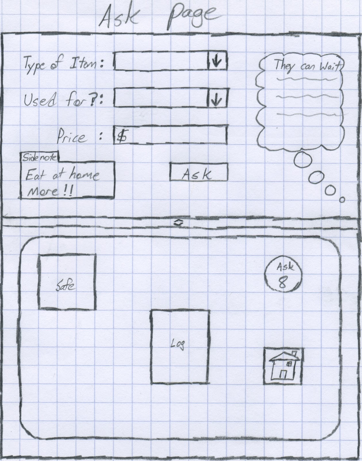
The biggest part of the project and perhaps the most important so far is the wireframe sketches we had to do. These sketches on pencil and paper give us rough looks at how things should look on the interface when we actually go to design it in Illustrator. The importance of theses is so that we don't just jump right in and start placing things randomly only to find out that they don't work. The time and effort put into these save greater time and effort in the future when preventing further mistakes and flaws from poor planning. Each page is mapped out from the log-in page to the ask page. and they are in order below.
Site Diagram
The site diagram gives a greater break down of the features and where they would be. In other words, I took the features and moved them to which page you would see them on. It is really quite simple, but important because this is to help judge how much room and what you need to make room for on each page.
Subscribe to:
Posts (Atom)