Tuesday, November 8, 2011

Research on apps and Inspiration

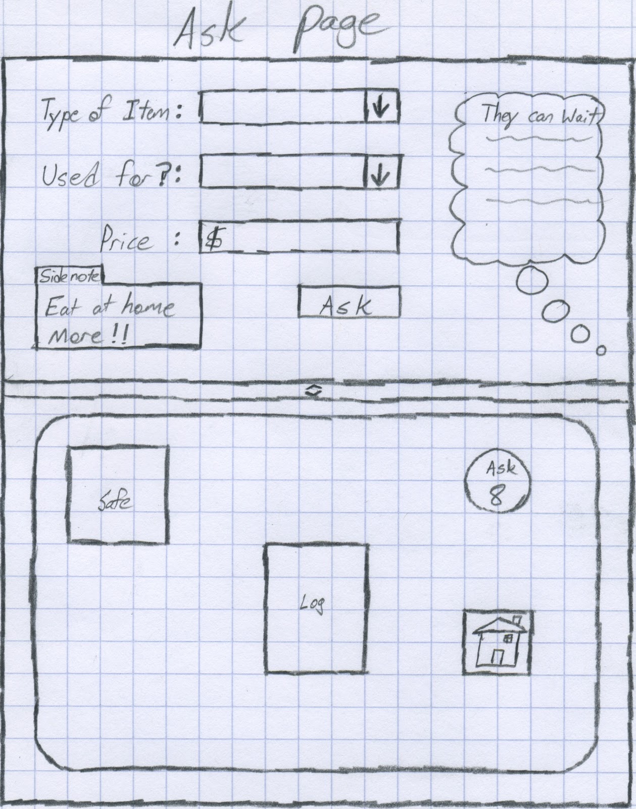
The next phase in the project was to research apps we felt were designed well and list the colors and all the other bits and pieces that would make our project whole. We chose our various colors and since mine is Commerce Bank related I felt it necessary to make one of the main colors to be their green. Next I selected three possible typefaces that not only look good on the Ipad 2, but would also give the feeling that this is a banking app that we are looking at. We then listed the different metaphors and textures we would be using in our app. Metaphors meaning if you are recorded something, show a journal or to keep track of money have a safe. Lastly, and the most interesting part of the assignment was the inspirational part of the piece.

First, I chose the Knight, death, and the devil because the overall meaning of the painting is though despair is all around him and that death is inevitable he keeps pushing forward with his faithful companion to the castle in the back. In a sense don't give up even when things look grim. I feel the same goes for our flag and the Spartan armor also. Our flag symbolizing our independence from Great Britain and the Spartan armor representing a warrior who would rather die admirably than retreating from battle. Lastly, the one hundred dollar bill showing not only a wise and influential man, but also being high currency in our nation and how important it is to keep track of it.


Wireframes

The biggest part of the project and perhaps the most important so far is the wireframe sketches we had to do. These sketches on pencil and paper give us rough looks at how things should look on the interface when we actually go to design it in Illustrator. The importance of theses is so that we don't just jump right in and start placing things randomly only to find out that they don't work. The time and effort put into these save greater time and effort in the future when preventing further mistakes and flaws from poor planning. Each page is mapped out from the log-in page to the ask page. and they are in order below.


Site Diagram

The site diagram gives a greater break down of the features and where they would be. In other words, I took the features and moved them to which page you would see them on. It is really quite simple, but important because this is to help judge how much room and what you need to make room for on each page.


App Def. and List of Features

Next in this process was to create a thorough definition of your application and a list of features that would be included in said app. The definition itself should be very clear and to the point without missing any details that may be needed when we make our list of features. With the mention of the definition I should probably say what my application theoretically would be. My application is a banking app for Commerce Bank targeted towards college students that will not only make banking easy, but more enjoyable to do. With this, the user is able to not only view there current accounts with Commerce, but make personal logs too while receiving feedback from the app itself. Another feature I love about it is you can ask it whether or not you should buy something by giving it information about including how much it costs.

Then the list of features tells what this app in a nutshell can do. All the bits and pieces that make up your app from the buttons to what pages are included. With both the definition and features the second part of this project is complete.

Basic Research


On this attachment I have some basic research specs that designers like me have to take into consideration when making apps. For this particular project the first thing we had to do is get a feel for either the Ipad 2 or the Samsung Galaxy tablet. I chose the Ipad 2 because I am a little more familiar and comfortable with it.      There was more that I could have put in the ways of research, but the thing about this project is we won't actually be making a full-fledged app.